So...before I ever post pictures of new fabric I'm getting ready to launch in the Etsy store, I always go through a several rounds of design, ordering of swatches, washing of swatches and only THEN do I take the photos, post the pictures on my blog and declare the fabrics ready to sell.
I follow this process this because I'm very particular about my colors, and because digital printing can be tricky with getting the color you're looking for and in getting the colors to hold up the way you want them to.
And I got so excited about this new Nesting Chairs collection that I broke my usual process (bad designer) and did not wash my fabrics before I snapped pics and posted them in my sneak peek post. Well... I washed the fabrics last night and 4 of the 5 are divine. Colors holding well and just what I had hoped.
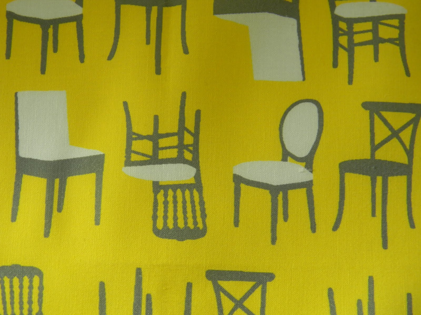
BUT, I'm just not happy with the way the yellow background is holding up in this chairs fabric.
(This is the pre-washing photo)

The large areas of uninterrupted yellow background are just not setting very well. (I've experienced this before with yellows and greens as well...) So what this means is that this design just isn't going to end up working out for digital printing in it's current incarnation. So, I'm going to have to reduce large fields of contiguous yellow in this design. Which makes me sad because I love it just like this... But that's nature of the beast.
I've been tinkering with the colors and wanted to get your thoughts because I am really torn. It's also an interesting view into how much color modifications can really change the feel of a design.
#1: I started by simply swapping the colors (light grey background, yellow chairs and dark grey upholstery.) Not loving this...

#2: So then I tried mixing up the colors and making some of the chairs yellow and some dark grey but keeping the light grey background. Better, but not perfect...

#3: So then I tried swapping the light and dark grey and really not loving this at all...

So I'm left with a dilemma. I can keep tinkering with lighter and darker shades of grey which would probably make some impact, but frankly, what I really want is the one with the yellow background that I started with! But since that's not an option, of these 3, I am probably leaning towards #2.
So I'm going to delegate the decision to you guys. :)
Do I go ahead and kill the yellow chairs design and just launch the collection with 4 patterns? Or do I replace the yellow chairs with #2 above? Or do I keep tinkering with different greys?
My gut tells me that none of them will have the feel that I'm after (because I want the yellow background!) and that I should just put that design on a back burner for now and go with the 4 in the collection instead of 5. Aaargh!!! What do you think? Your feedback would be MUCH appreciated!
p.s. Heather and Ashley: You ladies asked about other color stories for this collection. :) I am thinking of aqua and orange but am still tinkering... Feedback from all encouraged of course!
Of course, it would be a few weeks before I could get these tested and ready for sale. But what do you think?